
A chart is a tool you can use to communicate your data graphically. Displaying charts in PowerPoint allows your audience to see the meaning behind the numbers, and it makes showing comparisons and trends much easier.
SlideGarage’s range of Chart template for PowerPoint, Slides and Keynote makes life easier if you are preparing for a meeting which needs more graphical and statistical information about your business, products or services. Our chart designs are appropriate for business and lecture room presentations on education, health & trading.
Our Chart template for PowerPoint has individual object, so it is extraordinarily simple to edit/color each country according to your wants. You can additionally add your personal objects, results, texts, and many others. You should be able to double click on the chart which opens up an excel sheet where you can input your data based on your requirements. Itsvery easy to edit and simple to bring out statistical characteristics of your ideas and dashboards for your audience.
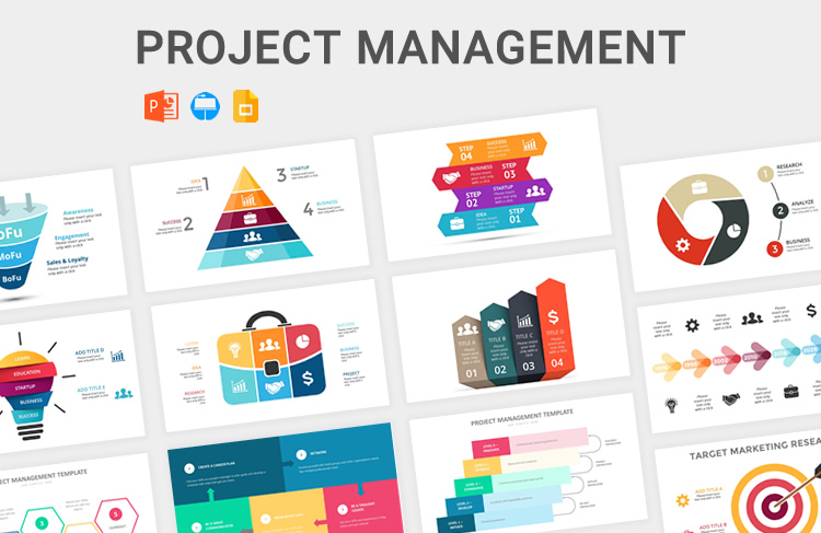
Typically, below are some of the chart templates for PowerPoint that we have as part of our downloadable PowerPoint, Keynote and Google Slides Chart templates.
- Flow chart template – Editable flowchart templates and process mapping templates to quickly modify and add to your presentations/ documents. You can refer to our Flow Chart Section.
- Gantt chart template – A Gantt chart is a horizontal bar chart used to show a project plan and its progress over time. Gantt charts are incredibly useful in project management because they allow you to track the status of project tasks. They also help keep track of deadlines, milestones, and hours worked.
- Organizational chart template – Editable Organizational Chart templates to quickly edit and add to your presentations. Many exporting options, styling options to quickly create and communicate your team profiles and organizations.
- Pie chart template – Need to visualize proportions or the composition of a whole? SlideGarage’s pie chart templates allow you to start from professionally designed pie charts that are ready edit and use with ease.
Depending on the type of chart you chose, your spreadsheet may look different A stacked bar chart, for example, might have multiple columns with numeric values inside of the spreadsheet.
You can always master the data in a chart before you begin styling it. But when you are finished with building out your charts, PowerPoint has plenty of options to change the look and feel of a chart.

Good content at fair price…
This package offers a good, diverse selection of charts. Each chart element can be customized to your liking/need, and the visual is pretty impressive to show in a small group at work. Really happy with it.